The Book Cover Design
-
Katarina Radovcic

- Posts: 75
- Joined: 08 Sep 2021, 08:19
- Currently Reading:
- Bookshelf Size: 95
- Reviewer Page: onlinebookclub.org/reviews/by-katarina-radovcic.html
- Latest Review: Scorn of Secrets by B. Truly
Re: The Book Cover Design
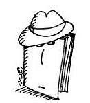
Yes, the angle isn't coincidental either. It presents the building looming over the city, but even more so the mystery and the darkness looming over the protagonist. And yes, exactly like you said, John as well as the reader can't put a face to it, we only get the idea of its presence.Brett Linette wrote: ↑19 Nov 2021, 06:20I noticed that the angle of the font resembled that of a building when you look up at it from the ground, but it never occurred to me that the name of the building is in place of its face because he can't put a face to it? I will never look at the cover the same way again; it's always going to give me chills from here on out.Katarina Radovcic wrote: ↑19 Nov 2021, 05:25 What grabbed my attention the most is that, obviously we have a silhouette of our protagonist with his emotions that we read about in the book, as well as the headache, but the title of the book is really interesting. The design of the title is supposed to represent the building. We have its name - "The Freedom Building", but just like in the book where we don't have a clear image of building, we don't see any shape of the title other than it's very dominant and it stands out.There is no shape, no nothing to indicate what the building looks like. There is no picture of the building to reffer to. Just like John, we see and know of the building, it obviously exists, but all we really have is a name.
The dominant and unrevealing title stands for the mystery of the building, the unclear vision of it. The more I look at the cover, the more this idea fascinates me.
Thank you for the revelation.
I don't think I was ever this intrigued by a cover!
Latest Review: Scorn of Secrets by B. Truly
-
Abi McCoy

- Posts: 316
- Joined: 10 Aug 2021, 14:25
- Currently Reading:
- Bookshelf Size: 102
- Reviewer Page: onlinebookclub.org/reviews/by-abi-mccoy.html
- Latest Review: The Scrolls of the Bonefairy Castle by David Spiegel
I think the way the block white text is arranged to portray The Freedom Building was really well done, as is the fact that John is only shown in silhouette. Not to mention that his pose indicates deep contemplation or a painful headache. I loved this cover!
Latest Review: The Scrolls of the Bonefairy Castle by David Spiegel
-
katerina_12

- Posts: 195
- Joined: 10 Sep 2021, 12:06
- Currently Reading:
- Bookshelf Size: 28
- Reviewer Page: onlinebookclub.org/reviews/by-katerina-12.html
- Latest Review: The Maestro Monologue by Rob White
Yes, you are right, white is the color of purity, of hope. I think the color "white" is in every person, as well as in the protagonist. Although the protagonist has many flaws, we must not forget that he is also a human being and has a good side. The character is really a mix of red, black, and white. Thanks for this thought-provoking question, I wonder what you think about this matter?Brett Linette wrote: ↑19 Nov 2021, 04:11Thank you for bringing the color scheme to my attention! I know different colors are said to evoke different emotions, but I can never remember what color evokes what emotion. I think the color white is thought to represent purity or something of that nature. Why do you think the font is written in white?katerina_12 wrote: ↑18 Nov 2021, 11:41 The cover of the book is mostly in black and red. Red is bold and conveys feelings of passion, and aggression. Black is serious and signifies mystery and death. You will find both colors in horror and thrillers. The colors create a tense mood from the beginning. The black shadow on a red background. This creates the appropriate mood for the reader to read the novel. I think the cover of the book is perfectly selected.
Latest Review: The Maestro Monologue by Rob White
-
review-specialist
- Posts: 293
- Joined: 13 Jun 2021, 12:28
- Favorite Book: Fouling in Business and College Athletics
- Currently Reading:
- Bookshelf Size: 33
- Reviewer Page: onlinebookclub.org/reviews/by-review-specialist.html
- Latest Review: The Encyclopedia Of American Animated Television Shows by David Perlmutter
I think the design was just right, a silhouette that leaves room for imagination while at the same time the gesture/stance of the silhouette evoked the emotions of the protagonist within the read.
-
Rodel Barnachea
- Book of the Month Participant
- Posts: 1676
- Joined: 24 Jun 2020, 22:16
- Currently Reading: The Unfakeable Code®
- Bookshelf Size: 87
- Reviewer Page: onlinebookclub.org/reviews/by-rodel-barnachea.html
- Latest Review: An Accessible Iliad by Emer Jackson
I'm sorry if I can't put it more concretely or elaborately, but the book has an effect on me that it is an exciting novel. The cover art looks decent and created by a professional, so that's nice. It's also appropriate for the themes that the book contains: The main color is red, and one of the many things that the red hue represents is blood, which points to violence. Violence is one of the main themes of the book (terrorism both in the start and end of the book).
Latest Review: An Accessible Iliad by Emer Jackson
-
Marlene Venter
- Posts: 26
- Joined: 25 Oct 2021, 11:59
- Favorite Book: The Complete Sherlock Holmes
- Currently Reading:
- Bookshelf Size: 44
- Reviewer Page: onlinebookclub.org/reviews/by-marlene-venter.html
- Latest Review: The Biblical Clock by Daniel Friedmann and Dania Sheldon
I think the book cover adds to the mystery of the story. I prefer imagining characters for myself, so I am glad the cover didn't give a clear picture of the character.
Latest Review: The Biblical Clock by Daniel Friedmann and Dania Sheldon
-
Huini Hellen

- Posts: 1685
- Joined: 08 Sep 2020, 03:38
- Currently Reading: Conversing with Various Entities
- Bookshelf Size: 137
- Reviewer Page: onlinebookclub.org/reviews/by-huini-hellen.html
- Latest Review: A Walk in the Twilight by John J Bosco Jr.
I have a habit of trying to establish the subject matter of a book from its cover page. The silhouette together with the combination of red and black colours already create a mental image in the readers' minds, that what they're going to read is definitely action-packed and thrilling as well.
The mind adapts and converts to its own purposes the obstacle to our acting. The impediment to action advances action. What stands in the way becomes the way. - Marcus Aurelius
Latest Review: A Walk in the Twilight by John J Bosco Jr.
-
Jodeci 007
- Posts: 103
- Joined: 05 Nov 2021, 08:16
- Currently Reading:
- Bookshelf Size: 38
- Reviewer Page: onlinebookclub.org/reviews/by-jodeci-007.html
- Latest Review: Kalayla by Jeannie Nicholas
After reading the book, I got to understand certain aspects of the book cover, but before then, I didn't think much of it, and it's not very easy to capture the full essence of a book by just the book cover at times.
Latest Review: Kalayla by Jeannie Nicholas
-
emeraldlaurice012

- Posts: 263
- Joined: 28 Jul 2020, 14:24
- Currently Reading:
- Bookshelf Size: 49
- Reviewer Page: onlinebookclub.org/reviews/by-emeraldlaurice012.html
- Latest Review: Poetic Thoughts of a Young Lion in the Asphalt Jungle by Steven Ederson Sr
The silhouette is really fitting to the theme of the story. It portrays a dark space, which is very fitting, as the protagonist in the story was left in the dark.
-
Iva Stoyanova

- Posts: 768
- Joined: 24 Jun 2020, 04:23
- Currently Reading: WatchDogs Abnormal Beginnings
- Bookshelf Size: 272
- Reviewer Page: onlinebookclub.org/reviews/by-iva-stoyanova.html
- Latest Review: Tau Ceti: A Ship from Earth by George T. Hahn
- Reading Device: B00JG8GOWU
I think the cover represents very well the themes from the book. It suggests lots of mystery by the protagonist's silhouette, the colors are black and red speaking of blood, violence, action-packed plot, etc. The cover looks very professional and very well thought out.
"You can be more aware and more present simply by resting in the present moment, open to all that is, without trying to control it or grasp it with the mind. Truly, a marvelous way of being!"
Richard L. Haight
Richard L. Haight
Latest Review: Tau Ceti: A Ship from Earth by George T. Hahn
-
Limpho Mojakisane

- In It Together VIP
- Posts: 427
- Joined: 07 Sep 2021, 10:41
- Currently Reading: Operationalizing AI Governance: Ethical Strategies for Real-World Impact
- Bookshelf Size: 111
- Reviewer Page: onlinebookclub.org/reviews/by-limpho-mojakisane.html
- Latest Review: The Village Blacksmith By Henry Wadsworth Longfellow by John W Babin
- 2025 Reading Goal: 40
- 2025 Goal Completion: 20%
I also find the silhouette on the cover to be a good addition. It has some form of mystery when first viewing it and makes one want to really know more of the contents of the book. At face-value, it just seems like someone with a headache but once you read the book, you get to understand the deeper reflection of the silhouette. I believe the author has really outdone himself on this one. And the colors too, red and black are a good combination. While red represents determination, passion and so forth, black represents mystery, secrets and so on. So after reading the book, I think its easier to understand why the author combined both of this two strong colors.
-
Theexceptional
- Posts: 26
- Joined: 16 Nov 2021, 07:19
- Currently Reading:
- Bookshelf Size: 15
- Reviewer Page: onlinebookclub.org/reviews/by-theexceptional.html
- Latest Review: Fulfillment by ICA
I think the book cover is appropriate. The protagonist's demeanor alone reveals a lot about the mental battles he's going through.
Latest Review: Fulfillment by ICA
-
Joseph Mutuku 1
- Posts: 143
- Joined: 28 Jun 2021, 08:42
- Currently Reading: TBD August 2022 Book of the Month
- Bookshelf Size: 65
- Reviewer Page: onlinebookclub.org/reviews/by-joseph-mutuku-1.html
- Latest Review: The Maestro Monologue by Rob White
I think the book's cover page was creatively designed. Apart from the silhouette of the supposed protagonist, the mix of the color in the cover page was creative and clearly hinted at what was in the book. For instance, the silhouette was black signifying mystery and death. But it could also mean characters left to be revealed and judged by the readers themselves through reading.
Latest Review: The Maestro Monologue by Rob White
-
Sarah Sonbol

- Book of the Month Participant
- Posts: 783
- Joined: 19 Jun 2021, 06:18
- Currently Reading:
- Bookshelf Size: 88
- Reviewer Page: onlinebookclub.org/reviews/by-sarah-sonbol.html
- Latest Review: Virus 4 Peace by June
The cover may fit the book, and the silhouette is really nice. However, I didn't like the red colour at all. I don't think that this cover would encourage me to pick this book for reading. I only got interested because of the book's reviews.
Latest Review: Virus 4 Peace by June
-
Timothy Rucinski

- Book of the Month Participant
- Posts: 1567
- Joined: 22 Apr 2018, 07:20
- Favorite Book: Dead Bob
- Currently Reading: The Complete Stories
- Bookshelf Size: 677
- Reviewer Page: onlinebookclub.org/reviews/by-timothy-rucinski.html
- Latest Review: No Truce With The Vampires by Martyn Rhys Vaughan
- Reading Device: B00JG8GOWU
- 2025 Reading Goal: 75
- 2025 Goal Completion: 13%
I just started the book but already I feel that the cover design sets the stage remarkably well for the story. The title, vertically placed in the image of the building, works effectively, as do the stark graphics. I'm a big believer in minimalism when it comes to a book's cover and the red and black imagery truly captures one's attention. The aspect of a thriller is evoked by the imagery and color, reminiscent of potboiler paperbacks from my younger days.
Latest Review: No Truce With The Vampires by Martyn Rhys Vaughan


 on Bookshelves")


